Meeting Room Display Interface Design
Today, I wanted to walk through our approach to UX/UI Design. I’m going to use Room Booking as an example.
Room Booking is one of the most common features we deploy in our projects. Almost every organization requires some level of resource booking, whether it’s a simple booking & availability workflow or a completely custom experience with complete room automation.
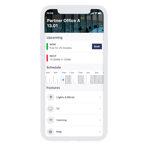
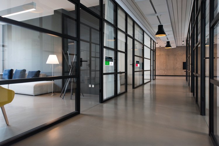
I’ll be focusing on one component, Room Booking Displays.
The Approach
There are four key criteria that need to be met for good user interface design. Comprehension, Legibility, Compatibility, Usability. Failing to meet any one of these requirements negatively impacts user experience. The types of challenges vary across each aspect, ranging from technical to design challenges. It’s important to tackle each one with care.
The aim was to achieve a simple design, that’s easily understood, that provides only the relevant information but also allows for the user to easily access expanded information if they need to.
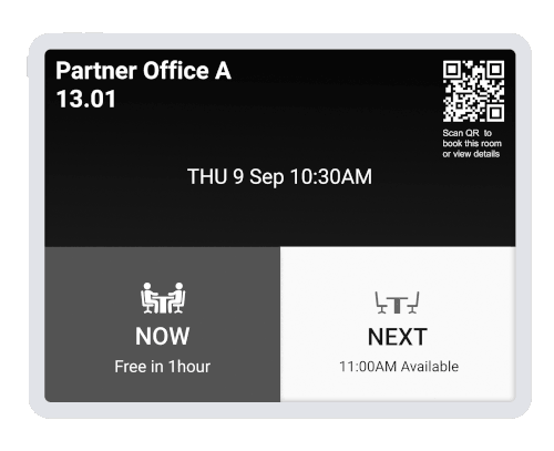
The information hierarchy was important here, users need to know what’s happening now, what’s coming up, and then be able to book the room using the display. Let’s take a look at each criteria with this in mind.
Comprehension
Requirement: Information on the display needs to be easily understood, even at a glance. The most important information is availability, for both now and the future.
The simplest way to achieve this is with a traffic light system, green for available, red for booked. Placing the colors in large blocks means anyone can instantly see if a room is available or booked right now, or in the future.
Legibility
Requirement: Legible from a distance and only the most relevant information should be displayed.
There is overlap with comprehension here, the large block colors in conjunction with the traffic light system provide a legible way to interpret availability even at a distance or from an obscure angle.
The second component is providing all the relevant information without overcrowding the display with too much information. This is achieved through a QR Code that users can scan to bring up a browser or application with more in-depth details while keeping the main display clear for only the most important information.
Compatibility
Requirement: Compatible with multiple display devices, even ones like ink displays that don’t have color. Compatible with both interactive and non-interactive devices.
The design is simple enough that it works on different devices with different aspect ratios and resolutions. Color can be managed by different shades of gray representing the two most important colors, green and red. Light for green, dark for grey.
Usability
Requirement: The ability to check in and make bookings.
This is about implementing a workflow without breaching any of the previous requirements.
The process covers both interactive and non-interactive displays by offering the option to book or check-in via the QR code.